DEALS S.A.
Rebranding, ID & Web Design
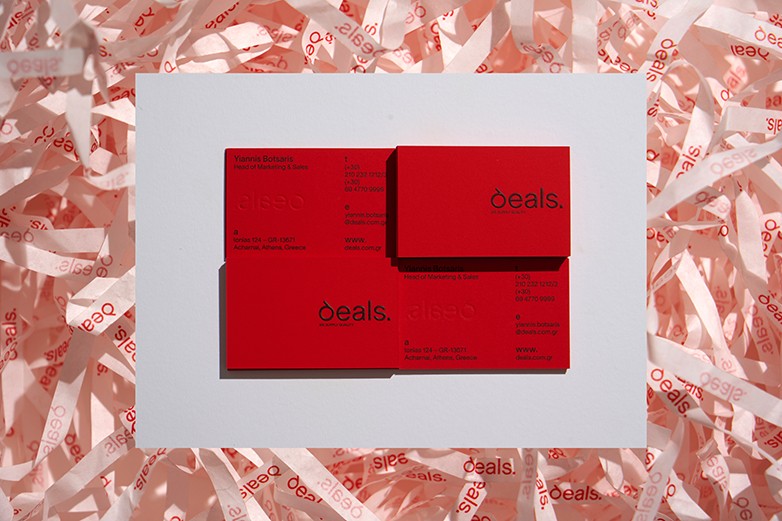
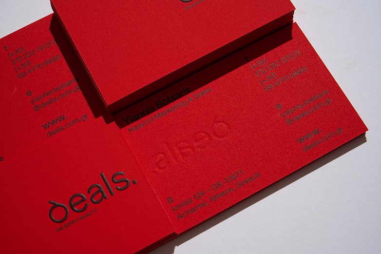
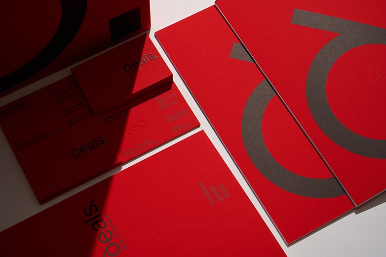
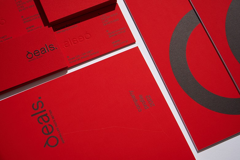
For the DEALS S.A. rebranding we chose a direction that combined the brand’s solid corporate character with a modern minimalist approach in terms of visual allure. A sophisticated and bold logo enhances the company’s visibility and “sexiness”, while a Greek-inspired “d” highlights the brand’s connection to its country of origin. The black, red and white colors are the pillars of a color-coding strategy that captures the attention in a stimulating and engaging way without overriding the client’s business profile.
GIAGKOS PAPADOPOULOS / Photography


