ERTHE
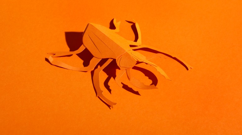
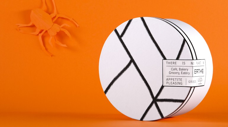
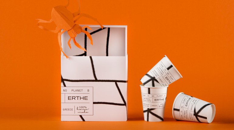
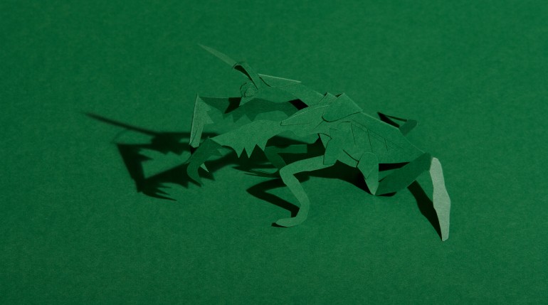
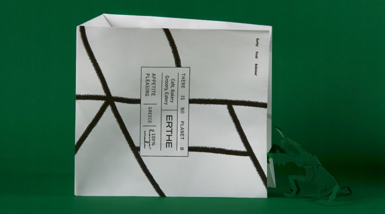
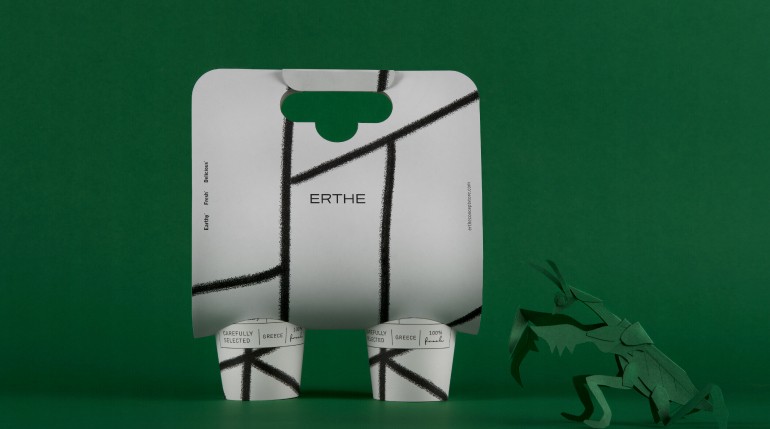
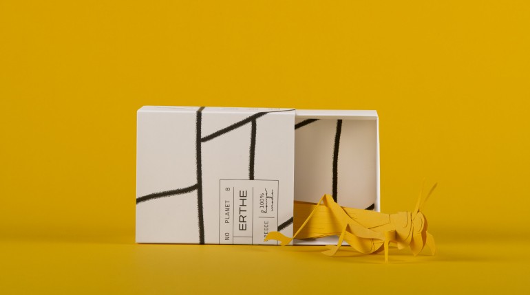
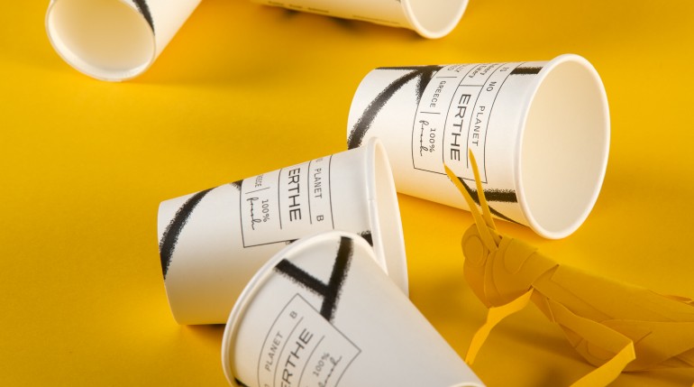
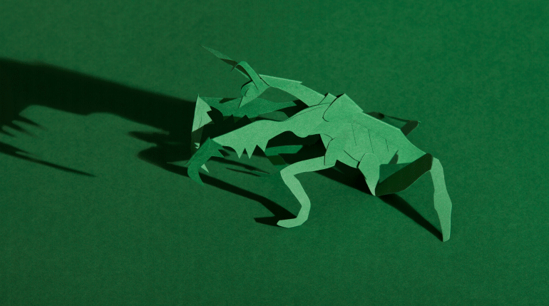
ERTHE, a medieval word meaning earth, is the name we came up with, for an Athenian concept store operating as an organic Café, Bakery, Grocery and Eatery. The inspiration behind the packaging design derives from the top view of a field. The abstract depiction of the ground, as seen from above, with black lines crossing it seamlessly, creates a strong bond with the natural, earthy narrative on which the brand identity is based. In an equally linear way, we designed an info system -built into the key visual- that allows the product to present its features, again, as if amidst a carefully ploughed piece of land. A beetle, a European mantis and a grasshopper, all made of colorplan papers by artist George Tserionis, served as conceptual props for our ERTHE packaging photoshoot. The idea was to create a visual environment that matches the brand’s organic identity, a static yet playful tale that subliminally suggests that a contemporary product could have a stronger connection to nature than someone may have guessed. Creatures of the earth surround ERTHE like secret allies in a minimalist scenery that evokes calmness, serenity and a beautiful modern aesthetic, the kind that does not take itself too seriously.
GEORGE TSERIONIS / Art works GIAGKOS PAPADOPOULOS / Photography