ARTY TOURS
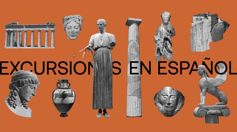
Rebranding Arty Tours was such an amazing creative challenge. This is an already established brand in Greece, with a unique niche audience: Spanish speaking travelers. Arty Tours has been offering exclusively Spanish speaking guided tours in Greece, since 1987. It was in need of a fresh image, one that would communicate the brand’s love for Greek culture and its deep know-how of sharing it with the Spanish-speaking visitors of Greece.
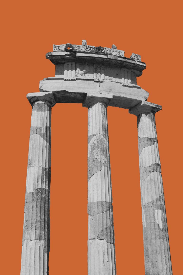
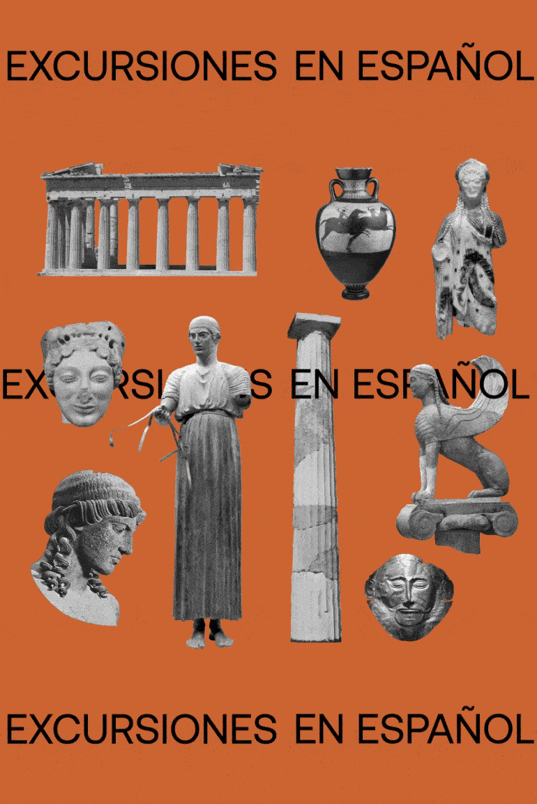
To that end, we dived into the vintage campaigns of the Greek National Tourism Organisation and, naturally, into the depths of Greek culture itself. This time travel offered unique inspiration that manifested into bold design with a contemporary spirit. Just like the touristic posters of the decades between the late 1930s and late 1960s, we tried to build an image whose dominant message would be identified with Greece itself. The designers at the time where acclaimed artists who enjoyed a unique creative freedom, delivering strong visuals with collectible value.
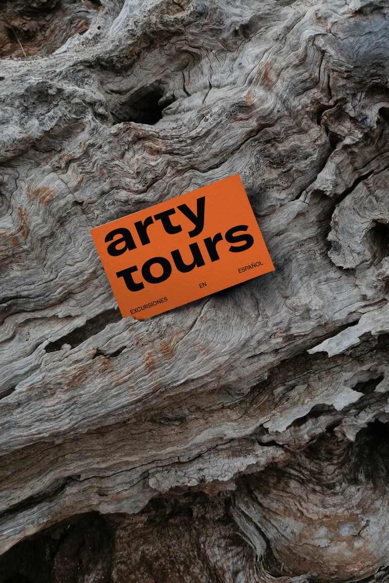
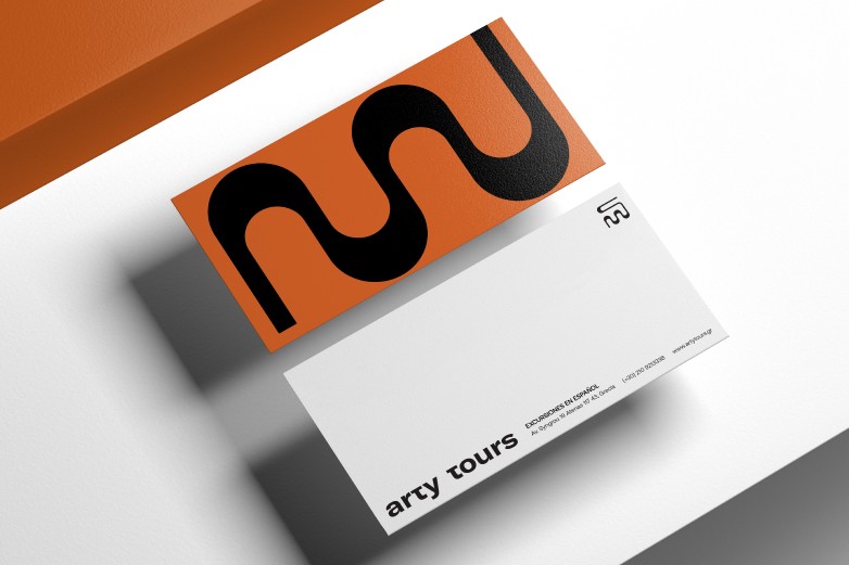
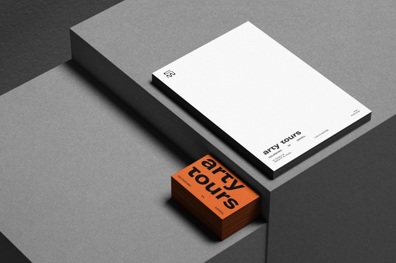
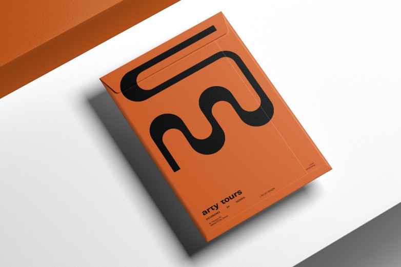
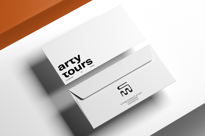
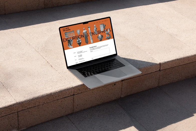
Channeling their vision, we tapped into the archetypes of Greek culture: The archaic black-figure pottery with its black-and-terracotta contrast palette, and the ancient columns’ capitals, but deconstructed into a light icon and a memorable pattern, are the basic elements of the new Arty Tours corporate ID. A logo with a clean font of remarkable impact, a bold usage of patterns that are ancient-inspired but not antiquity-obsessed, were applied to every corporate identity item, from the signage and architectural features of the offices to the design of the tour buses and, of course, to the fully redesigned website.