THE GRAND / GRAND HYATT
Logotype & Visual Identity
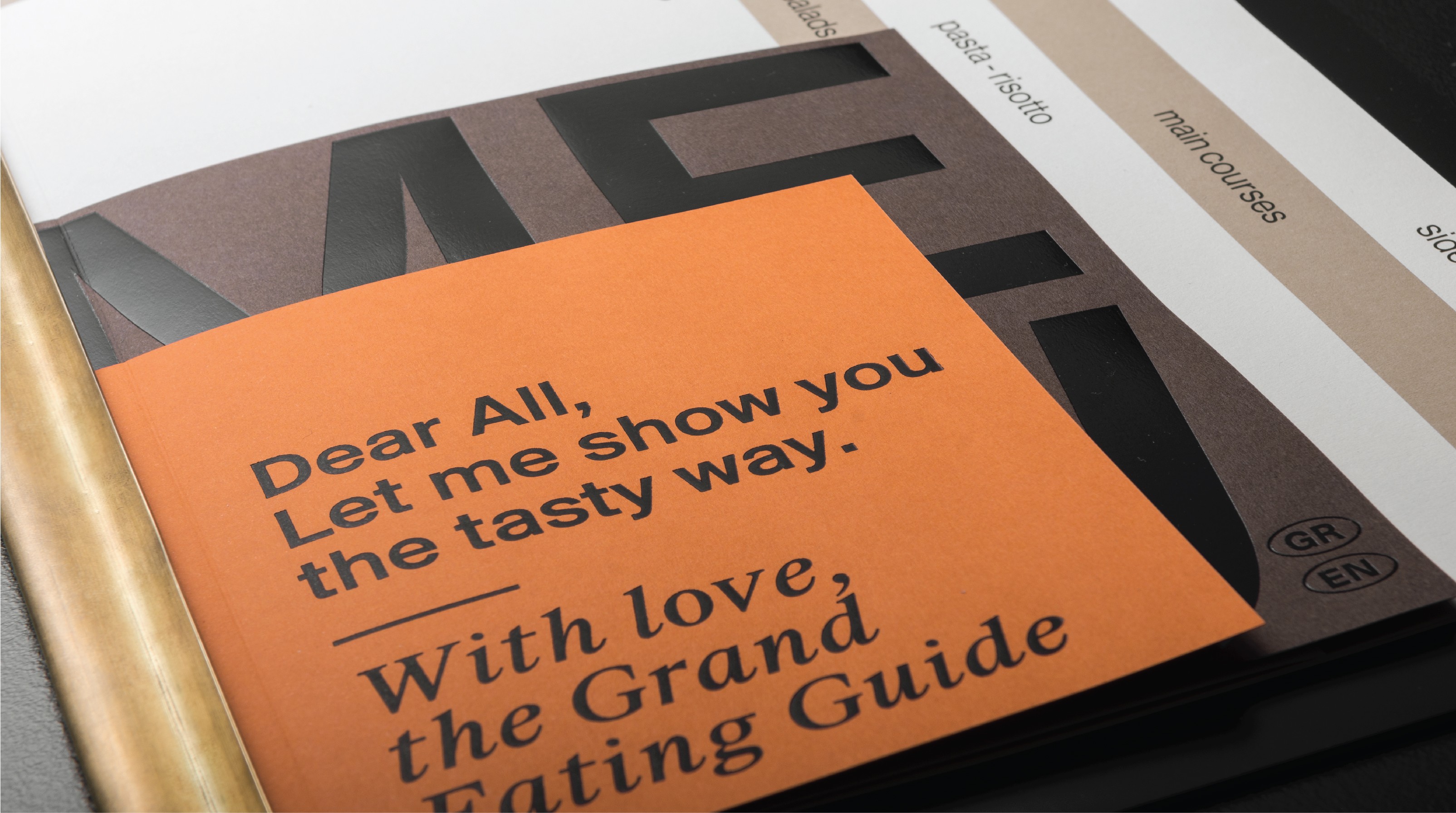
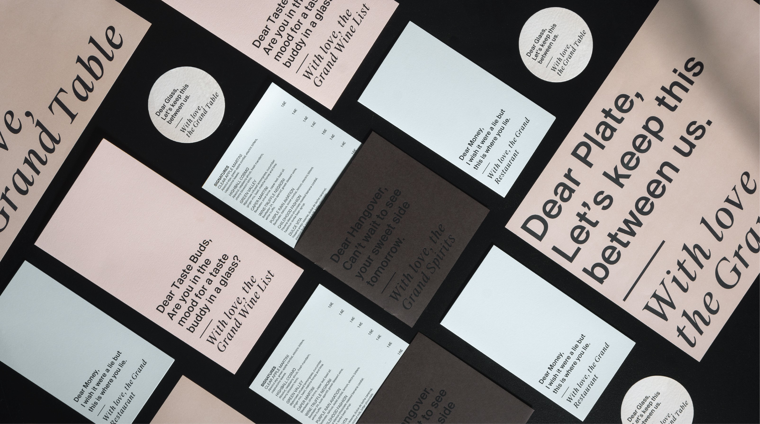
The idea behind the brand identity we came up with for The Grand by Interni restaurant was based on playful minimalism. The Doric logotype and the understatedly cool layouts stress the restaurant’s prestigious and modern profile, while at the same time, the short and funny texts accompanying the restaurant’s catalogues, sous-plats, sous-verres and other paraphernalia create a surreal dialogue between The Grand’s bits and pieces or even between abstract notions like hunger and money.


