DIMITRIS ECONOMIDIS
Packaging
DIMITRIS ECONOMIDES
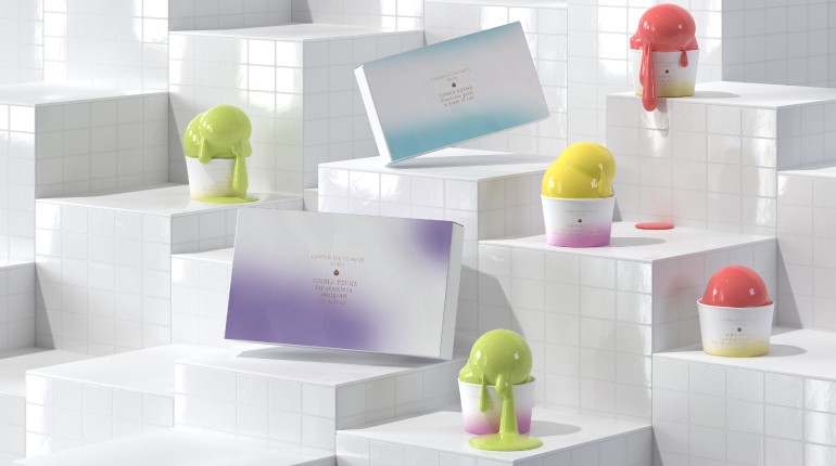
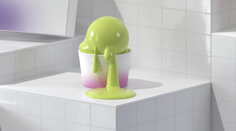
A gradient color palette of yellow, purple and blue, along with a few taglines describing the product as more of an experience than an actual commodity, gave us all we needed in order to create the visual identity and packaging for Dimitris Economides’ new ice cream. Our work is based on the pastritect’s general brand identity which we expanded to a greater, more playful and summery extent. What we aimed for was a minimalist approach on design, with clear, user-friendly lines, and a subtly upscale aesthetic, infused with bits and pieces of fun. We imagined the ice cream line as a sub-brand, bound to stay consistent with the main one but free to explore a new creative direction.